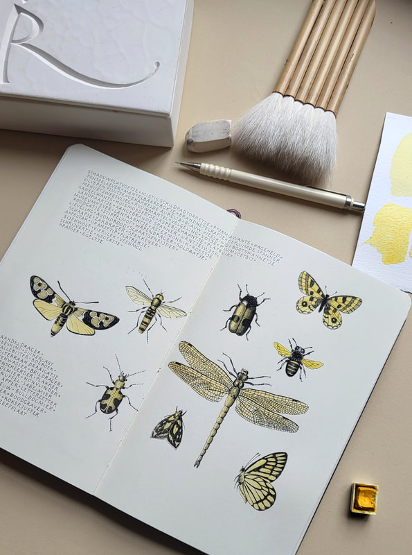
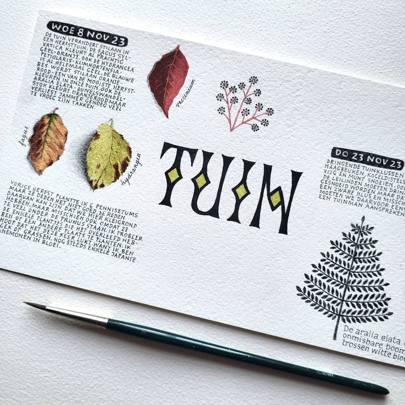
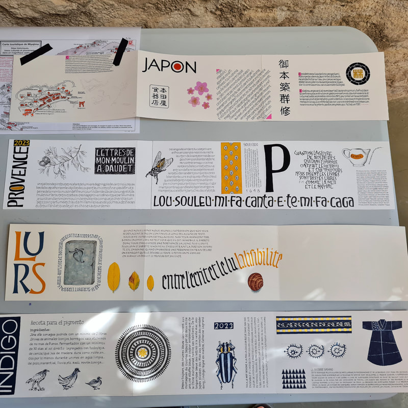
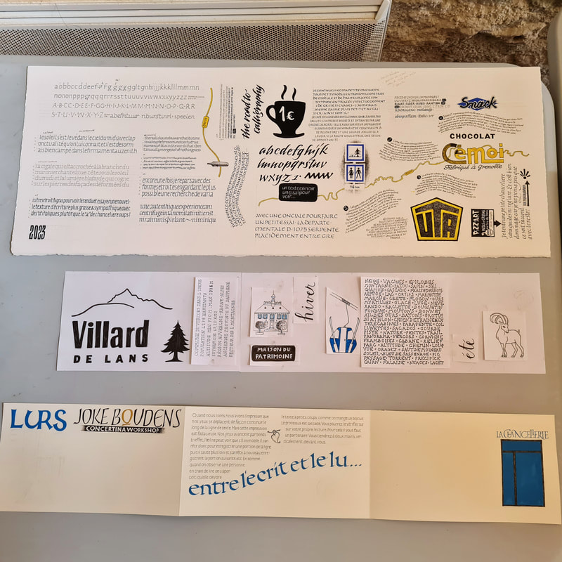
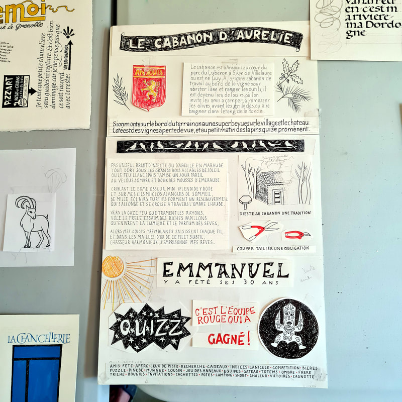
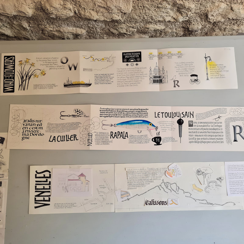
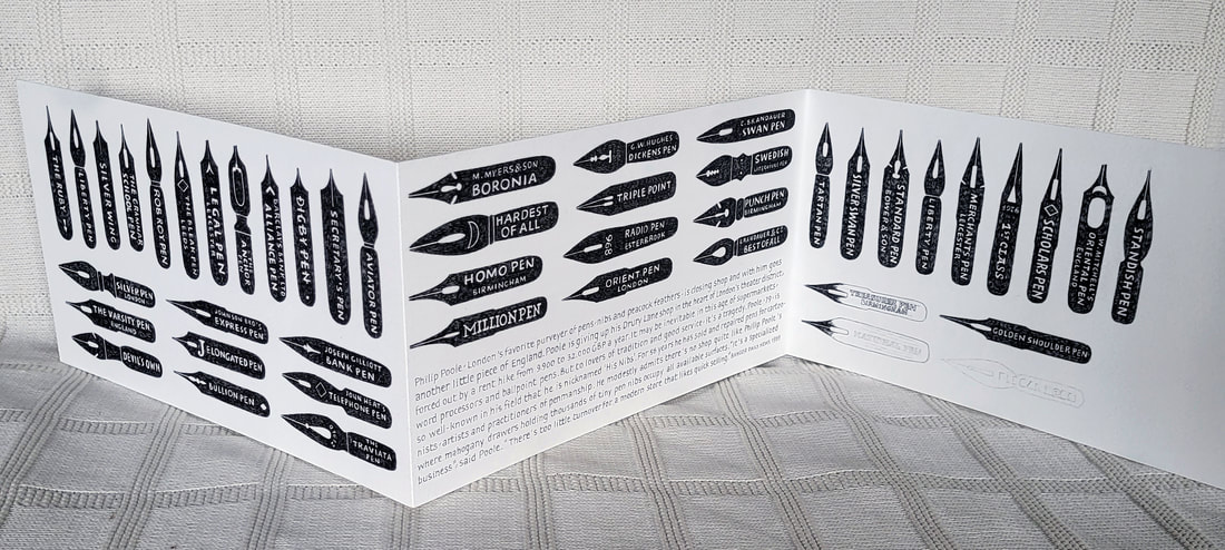
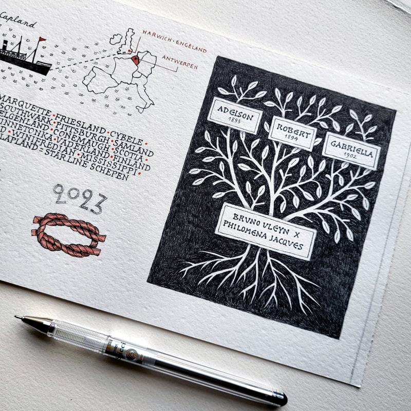
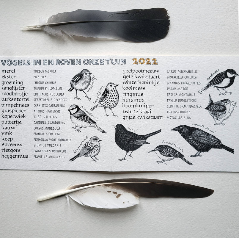
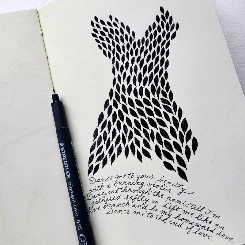
This is a small herbal book from the time long before my current concertina books. I remember writing it with a quill after I learned how to cut one. Since that time, I hardly ever wrote italic again. I realized that it wasn't my thing. Uncial, however, and capital letters, feel much better to me. And I still had to discover the beautiful rounded shapes of Carolingian minuscule! Most of my books now are written or drawn in some kind of Carolingian script.
0 Reacties
Back in 2000 I designed this poetic text for a headstone. At the time I just started drawing Roman capitals. Looking back now, I'm not too disappointed but spacing between letters and words could be a lot better. I don't like the ligature on the second line and the tail of the R is too weak. This design would benefit to be improved :) The text is from a German poet, Rainer Maria Rilke. Here it has been translated in Dutch, and I'll try to translate into English, as good as I can :
Two pages in my sketchbook. I have been re-working a stamps collection and chose for a limited color palette of 3 colors: orange, blue and light blue. I'm inspired by existing stamps but don't copy them. Some details are left out, certain fonts are adjusted and, anyhow, colors are customized. For orange and blue I used fine microns, light blue is executed in colored pencil.I'm a nature lover and a keen gardener and when I encountered this beautiful quote while surfing on the internet, I immediately knew I wanted to do something with it! When I make an illustration like this, in my sketchbook, I always start drawing a few small details in pencil, tracing the outlines with my fineliner and filling in the background, all with the same fine pigment liner. I never have a plan set out in advance, so I just draw and make it up as I go, and each decision I make creates a kind of set of rules to follow.
Years ago, I made this portrait of my paternal grandfather but never finished it. The intention is to add his name and some other text, although I don't know what yet. Anyhow, I want it to have the look of art nouveau style, with some decoration added. This was one of the first times I used stippling to create a portrait. It takes many hours of work but the advantage is that you can work for very short periods now and then and to me it is most relaxing!Recent painting of our 'granny' who turns 20 next year but still looks young! I painted her, as well as the background, with gouache and added some pattern using different cheerful Posca colors.I'm into blue and white pottery these last few months. It's not that I go crazy over Chinese bone, but I admire those artists from the distant past who were incredibly talented and inventive and I love to immortalize their art in my sketchbook. The illustration is accompanied by an inspiring text about beauty from the book 'El Profeta' by Kahlil Gibran.
|
AuthorJoke Boudens Archives
April 2022
Categories
Alles
Copyright Joke Boudens 2015. All images and content are the property of Joke Boudens unless otherwise noted.
|