Ik hou van kleurpotloden, eindeloos laag op laag zetten en er kan bijna niks verkeerd gaan. Ik heb ondertussen al heel wat ervaring opgedaan en leer nog steeds bij. Deze twee katten waren een goeie oefening.
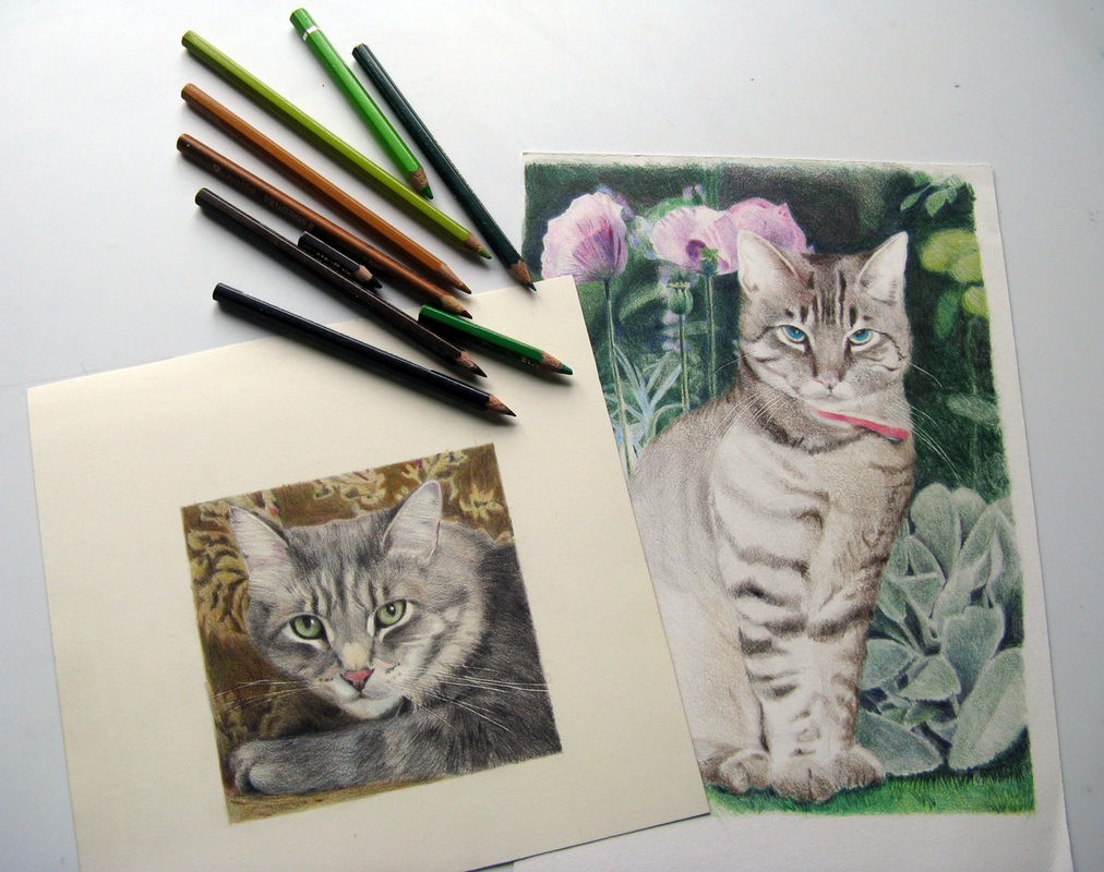
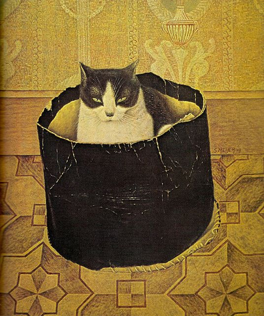
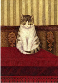
I love colour pencils and working with them. You can endlessly put layer upon layer upon layer and almost nothing can go wrong. Meanwhile I gained a lot of experience and am still learning. These two cats were a good exercise.
I love colour pencils and working with them. You can endlessly put layer upon layer upon layer and almost nothing can go wrong. Meanwhile I gained a lot of experience and am still learning. These two cats were a good exercise.


 RSS-feed