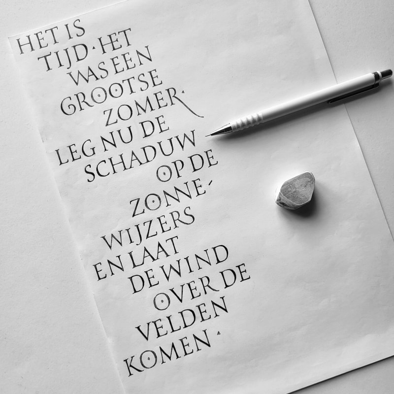
Back in 2000 I designed this poetic text for a headstone. At the time I just started drawing Roman capitals. Looking back now, I'm not too disappointed but spacing between letters and words could be a lot better. I don't like the ligature on the second line and the tail of the R is too weak. This design would benefit to be improved :) The text is from a German poet, Rainer Maria Rilke. Here it has been translated in Dutch, and I'll try to translate into English, as good as I can :
It is time
It was a great summer
Now put the shadow on the sundials
and let the wind float over the fields
 RSS-feed