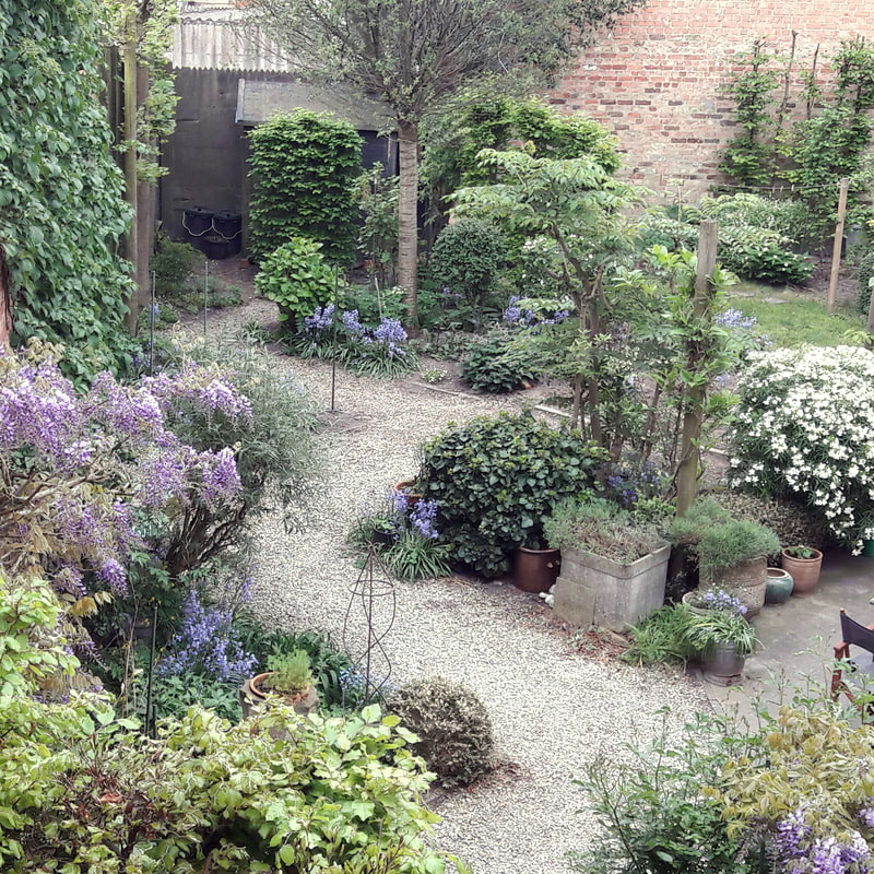
Our garden has never ever been so beautiful in all it's glory of fluorescent shades of blue: wisteria, bluebells, forget-me-nots, and the radiant white flowers of the Mexican orange blossom and the Solomon's seal. And each one of them has it's specific scent! We enjoy this view so much. Within a few weeks the garden will have a totally different look!
0 Comments
The sunny start of a new day in my studio! I have plenty of ideas and want to make them all come to life. But why do I always feel like life is too short? Our good friend Brody Neuenschwander gave me this wonderful book as a Christmas gift. It's about garden design, and this happens to be a big area of interest of mine. I want to make something in relation to gardens, maybe a print or a series of greeting cards!
Nu en dan ontdek ik kunstenaars die mij tot nu toe onbekend waren en die mij blij verrassen. Paul Mariën is zo iemand. Hij is een van die schilders die, naar ik lees, nooit tot een bepaalde stroming behoord hebben. Hij speelt in zijn schilderijen met tonaliteiten van kleur en licht. Zijn perfectionisme, de streng afgewogen volumes, de opbouw van zijn werk en de magisch-realistische inslag doen mij denken aan Magritte en Delvaux, maar ook aan sommige Vlaamse Primitieven. De lichteffecten en de roodgouden gloed die de meeste schilderijen uitstralen, ontstaan dank zij een delicate, zorgvuldige preparatie van de ondergrond. Paul Mariën brengt namelijk een grondlaag aan die samengesteld is uit Indisch geel, oranjegeel en Napels geel. Het resultaat is een zachte, fluweelachtige ondertoon die het licht reflecteert. Hetgeen zijn werk voor mij echt speciaal maakt is het gebruik van geschilderde letters, zo goed gedaan! Now and then I discover artists who were unknown to me until now and really surprise me. This is the case with a Belgian painter called Paul Mariën. He is one of those painters who, as I discover, never belonged to a particular movement. He plays with tonalities of color and light. His perfectionism, clean volumes, the structure of his work and the magical-realistic feeling make me think immediately of Magritte and Delvaux, but also of some Flemish Primitives. The lighting effects and the red-golden glow of most of his paintings originate thanks to a delicate, careful preparation of the canvas. He applies a primer layer which is composed of Indian yellow, orange yellow and Naples yellow. The result is a soft, velvety undertone, which reflects the light. The thing that makes it really special to me is the use of painted letters, so well done! Bronnen: http://users.skynet.be/fa015162/nl/bionl.html
http://www.seniorennet.be/redactie/artikel/100/draken-en-dozen-portret-van-een-vlaamse-kunstenaar-- Ik hou heel erg veel van het werk van David Jones. Zijn letters zijn een blijvende inspiratiebron. De vrolijke en bekoorlijke letters staan in schril contrast met het moeilijke leven dat hij had. I am fond of the work of David Jones. His letters are a permanent source of inspiration. Cheerful and charming letters stand in stark contrast to the difficult life he led.
Dit schilderij is één van mijn absolute favorieten en staat afgebeeld in een boek dat ik al jàren in mijn bezit heb. Ik ben altijd fan geweest van naïeve kunst, ook wel 'outsider art' of 'art brut' genoemd. Dit werk is geschilderd door ene Sal Meijer en verder wist ik niks van hem noch van zijn werk. Na wat opzoekingen vond ik op Wikipedia toch wat meer informatie. Sal Meijer (Amsterdam, 1877 - Blaricum 1965) was een Nederlandse kunstschilder die bij voorkeur katten schilderde. Hij was een telg van een familie van Joodse diamantbewerkers. Door de simpelheid van zijn schilderijen en zijn bescheiden houding - hij noemde zijn schilderijen geen kunstwerken maar "schilderstukjes" - kreeg zijn werk vaak het stempel "naïef" of "primitief" opgedrukt. En wat een toeval, hij maakte ook verschillende schilderijen in en over Brugge. This painting below is one of my absolute favourites and is pictured in a book that I have in my possession since many years. I've always been a fan of naive art, also called 'outsider art' or 'art brut'. This work was painted by a man named Sal Meijer but apart from that I knew nothing about him or his work. After searches on the internet, I found more information on Wikipedia. Sal Meijer (Amsterdam, 1877 - Blaricum 1965) was a Dutch painter who preferably painted cats. He was a scion of a family of Jewish diamond workers. Because of the simplicity of his paintings and his humble attitude, his work was often labeled as "naive" or "primitive". And what a coincidence, he made several paintings of Bruges, my hometown. "Vreemde inhoud", 1909 Hier klikken om te bewerken.
"Delftsevaart in Rotterdam"
Weer een ontdekking: outsider artiest Eddie Arning. Hij werd geboren in een Duitse familie in Texas. Tot zijn 12 jaar liep hij school en daarna werkte hij op de familieboerderij tot hij 30 was en de diagnose gesteld werd van schizofrenie. De rest van zijn leven bracht hij door in psychiatrische inrichtingen en verzorgingstehuizen. Toen hij 66 jaar oud was moedigde een ergotherapeut hem aan om te tekenen wat hij ook de volgende jaren deed gedurende het grootste gedeelte van de dag. Hij vond inspiratie in herinneringen, boerderijdieren, machines en illustraties in populaire tijdschriften. Toen hij in 1973 verplicht het verzorgingstehuis moest verlaten en bij zijn zuster ging wonen stopte hij met tekenen. Another discovery: outsider artist Eddie Arning. He was born into a German immigrant family in Texas. He attended school until he was twelve and then worked on his family's farm until the age of thirty, when he was diagnosed with schizophrenia. He spent most of his remaining days in mental hospitals and nursing homes. When he was sixty-six years old, an occupational therapist encouraged him to draw, and for years he drew during much of the day. He found inspiration from memories, farm animals and machinery, and eventually illustrations in popular magazines. In 1973, after he was forced to leave his nursing home and live with his sister, he stopped making art. Oil pastel over graphite on tan paper - 15 3/4 x 21 1/2 inches Oil pastel - 49.5 x 65.4 cm (19.5 x 25.75 inches) - c. 1970 Mixed media on paper - 25.75 x 19.75 in - c. 1960's Bronnen: http://www.philamuseum.org/exhibitions/2013
http://fr.outsiderartfair.com/artiste/1428 http://www.riccomaresca.com/portfolio/eddie-arning Deze beroemde pennenzaak van Philip Poole in Londen moest in 1989 de deuren sluiten. De huur werd plots verdriedubbeld. En daarmee verdween ook weer een klein stukje Engeland. 56 jaar lang heeft Poole pennen verkocht over de ganse wereld. Ik denk dat hij nog steeds gemist wordt. Ik ben gelukkig met de doosjes die toen daar gekocht zijn: 7 stuks met telkens 100 verschillende pennen, en er zitten inderdaad geen twee dezelfde bij!
Philip Poole, London's favorite purveyor of pens had to close doors in 1989. The rent of his shop tripled. With him went another little piece of England. Poole has sold pens all over the world for 56 years. I'm sure he's still be missed. I am lucky to own 7 small boxes, each one filled with 100 different pens. Indeed, no two pens are the same! Illustratoren boeien mij mateloos.
De laatste jaren is er een groeiende belangstelling vanuit de VS voor het werk van Vlaamse illustratoren. Vooral bij de New York Times is er een blijvende vraag. Ook uitgeverijen van kinderboeken zijn lovend over de kwaliteit van hun werk. Dit is iets om terecht fier op te zijn. Naast illustratoren uit eigen land zijn er natuurlijk ook nog een resem buitenlandse kunstenaars waarvan ik het werk heel bijzonder vind: In recent years, Flemish illustrators are very sought-after in the US, particularly by the New York Times. The quality of their work also is praised by publishers of children's books. This is something to be very proud of. I will share some names in later blogs. Apart from them, there are a whole series of illustrators from over the world that I like a lot: Joanna Concejo joannaconcejo.blogspot.com Jeffrey Fisher http://www.rileyillustration.com/artists?artist=jeffrey-fisher Quint Buchholz www.quintbuchholz.de Ofra Amit www.ofra-amit.com Laurent Moreau https://nl.pinterest.com/7marie7/illustration-laurent-moreau Nina Smit http://nina-smit.nl Yelena Bryksenkova ybryksenkova.blogspot.com Marco Somá marcosoma.blogspot.com Golly Bard www.gollybard.com Becca Stadtlander beccastadtlander.com Shaun Tan www.shauntan.net Chris Van Allsburg www.chrisvanallsburg.com Manon Gauthier manongauthierillustrations.blogspot.com Maira Kalman www.mairakalman.com Ayano Imai https://nl.pinterest.com/princessstory/ayano-imai Martin Jarrie martinjarrie.com Bene Rohlmann http://benerohlmann.tumblr.com Iban Barrenetxea ibanbarrenetxea.blogspot.com #jeffreyfisher#quintbuchholz#laurentmoreau#beccastadtlander#shauntan#chrisvanallsburg#manongauthier#mairakalman De typische Shaker stijl: puur, simpel en sober. Reinheid, eerlijkheid en zuinigheid stonden hoog in het vaandel en dat vertaalt zich in de Shaker architectuur, meubels en gebruiksvoorwerpen. Geen nutteloze versieringen, maar duurzaam en functioneel. De Shakers waren van mening dat het met aandacht maken van een stoel, een tafel of een bezem een vorm van gebed was. Shaker style: pure, simple and sober. Cleanliness, honesty and frugality were paramount and that translates into the Shaker architecture, furniture and utensils. No useless ornaments, but durable and functional. The Shakers believed that constructing a chair, table or broom with great attention was a form of prayer. Stoeltje, gebruikt bij het sorteren van appels. Apple sorting chair. Bron: Willis Henry auctions
|
AuthorJoke Boudens Archives
Maart 2024
Categories
Alles
Copyright Joke Boudens 2015. All images and content are the property of Joke Boudens unless otherwise noted.
|