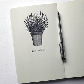
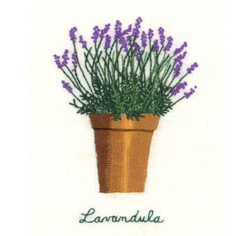
Some of my father's alphabets, as they were made ready to be printed in his first book in the 50's. He always worked on squared paper with Indian, waterproof ink and retouching with white gouache.
I realize that most of my drawings and texts are about nature, about the beauty and poetry in it, the positive vibes it gives. I feel that it's not really a free choice, more an irresistible urge and I don't want to oppose it. I do not close my eyes for all the grief and misery in the world, but I don't have the drive to focus on that, with all due respect for those artists who have the profound aspiration to do so and succeed in transmitting their beliefs. But in my work I want to show the opposite side of ugliness, negativity, misery and harshness. So here's a spread in one of my sketchbooks, filled with nature. The tree on the left side is the tree in our garden that I can see while eating in the kitchen. Especially in the morning, there are plenty of birds on the tops of the branches and it inspired me to make a drawing of it. In all honesty, I have to say that our birds are not yellow: they are sparrows, blackbirds, chews, titmice, collared doves and robins. On the right side of the page, I drew a plea to preserve and keeping survive folk art, very close to my heart! This can be in many areas such as woodworking, pottery, painting, embroidery, ironwork, furniture, silversmith's craft ... and that in all continents of the globe. I love to look at folk-art objects, generally simple in form yet amazingly beautiful! They keep inspiring me.
I have my sketchbooks to try out new ideas. When I'm happy with it, I take a nice sheet of paper and do the whole thing over again. This drawing is my representation of paradise. The words on the left and right are translations of the word 'paradise' in different languages of the world. A lot of people ask me how many pigment liners I use for one drawing like this so I put it to the test and, although this piece is quite big (50 x 70 cm), I only used one fineline, just at the finish starting a second one.
This is a - nearly finished - drawing from a collection of bottle caps. I only used 3 different sizes of black pigment liners. Why did I choose for crown corks? Because there's such a big variety of type in them. It made me reflect on the fact that every design, how simple it may look, is carefully thought of. And there's only limited space! I learned a lot about type by making this drawing.I drew this row of books on the bookshelf in my studio. I only used a very fine fineliner and a black pencil. It was an interesting exercise for learning about drawing type and the diversity of lettering forms.I've always wanted to draw a chicken but nothing ever came of it. Finally, last week, I spent the whole day drawing this huge black-and-white chicken in my Moleskine sketchbook, ànd doing the lettering. Now I'm figuring out what I will draw on the opposite page. I've already got some ideas! |
AuthorJoke Boudens Archives
Maart 2024
Categories
Alles
Copyright Joke Boudens 2015. All images and content are the property of Joke Boudens unless otherwise noted.
|